ClubNative
ClubNative is a specialised DJ hub and booking platform designed to bridge the gap between underground artists and credible bookers. More than just a marketplace, it serves as a cultural destination where the electronic music community can share their work, access industry education, and build their brands through direct peer-to-peer connection. The identity is anchored by the mission to document and empower the scene, ensuring that the transition from digital discovery to the physical booth is seamless and technically verified.
Name
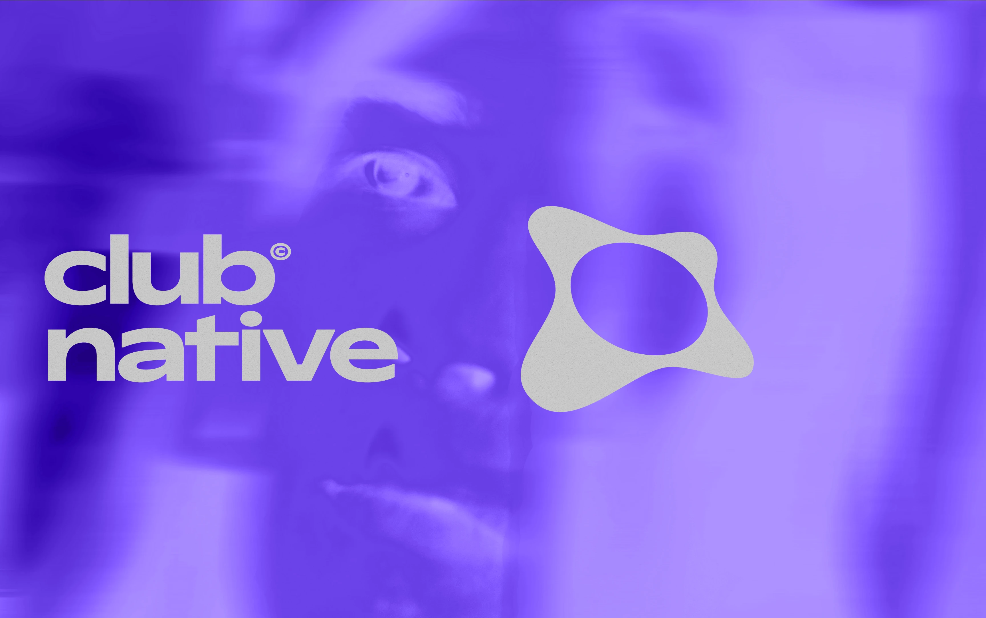
Logo Design
Colour Palette
Typography System
Art Direction
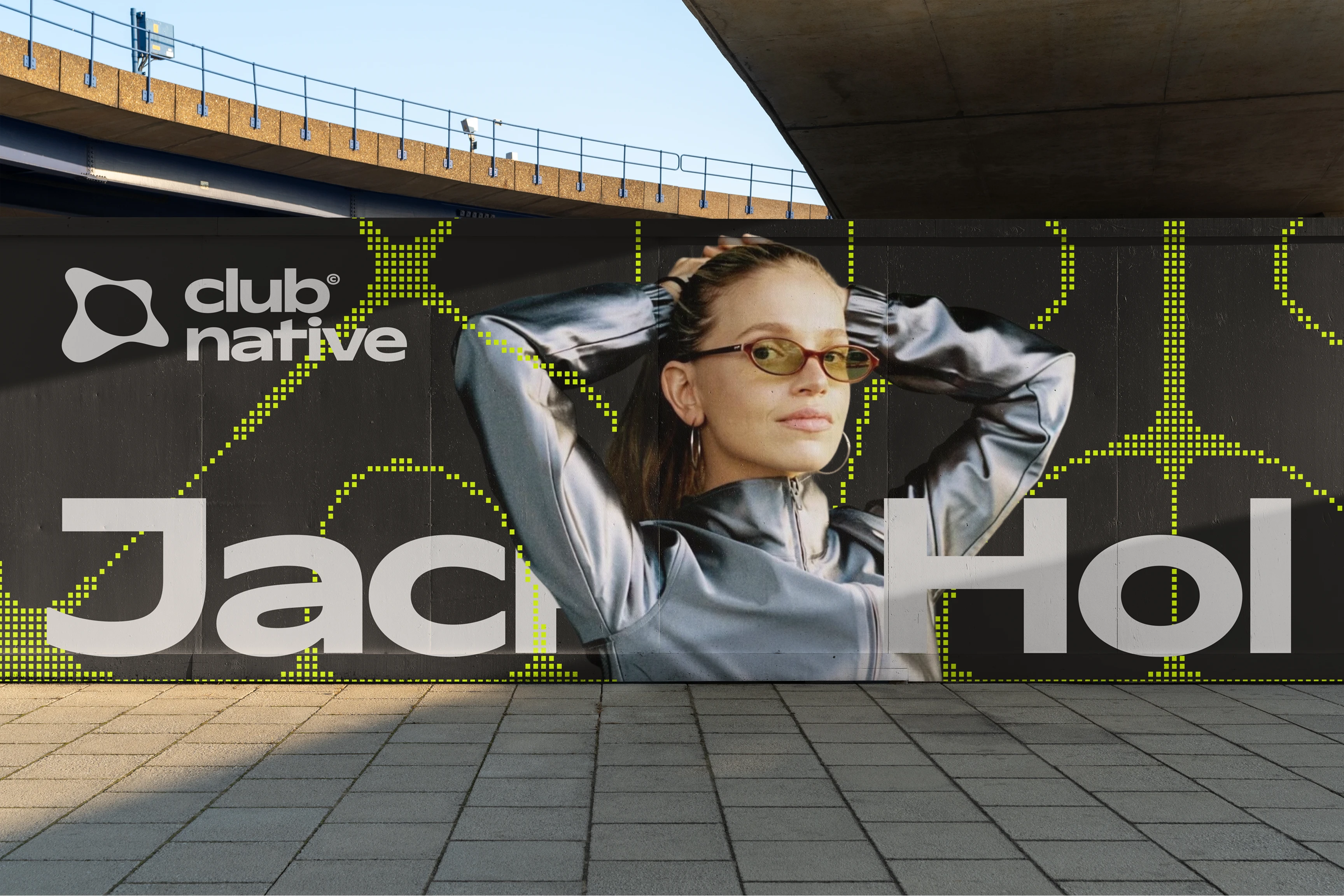
Brand Guidelines
Social Media Templates
Motion Identity System
Alex Ryan [Brand Designer]
Max Ivory [Naming & Strategy]
May 2026
Project Overview
Problem
The platform originally operated under a different name and visual identity that failed to resonate with its core community. This initial branding was unmemorable and lacked the professional edge required to convey the brand’s deeper values to its target audience. It struggled to articulate the brand's position at the intersection of professional reliability and underground authenticity, often appearing more like a broad, formal marketplace that prioritised volume over vibe. Consequently, it failed to build the necessary bridge of trust with DJs and bookers who value cultural relevance and technical expertise.
Solution
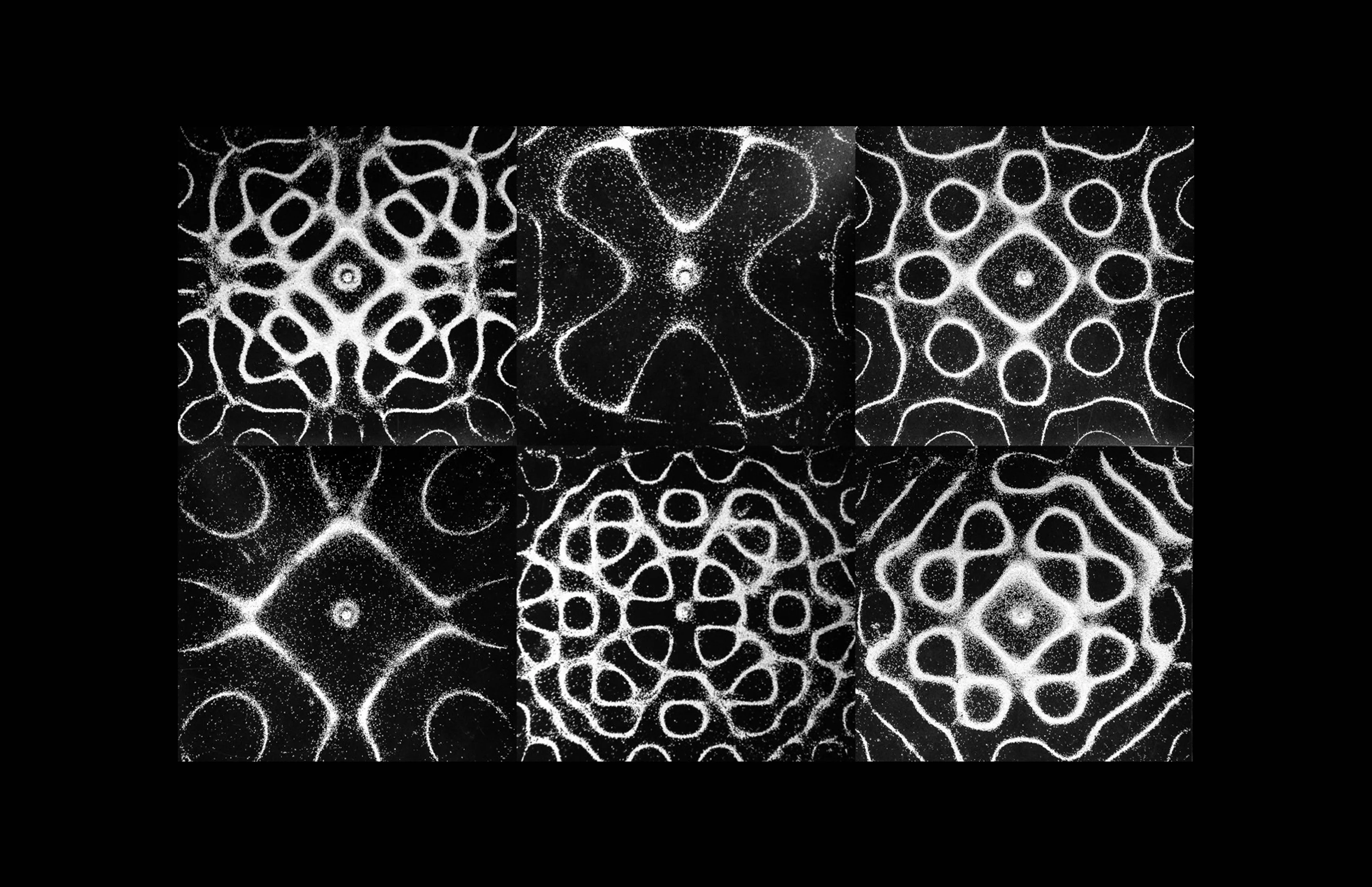
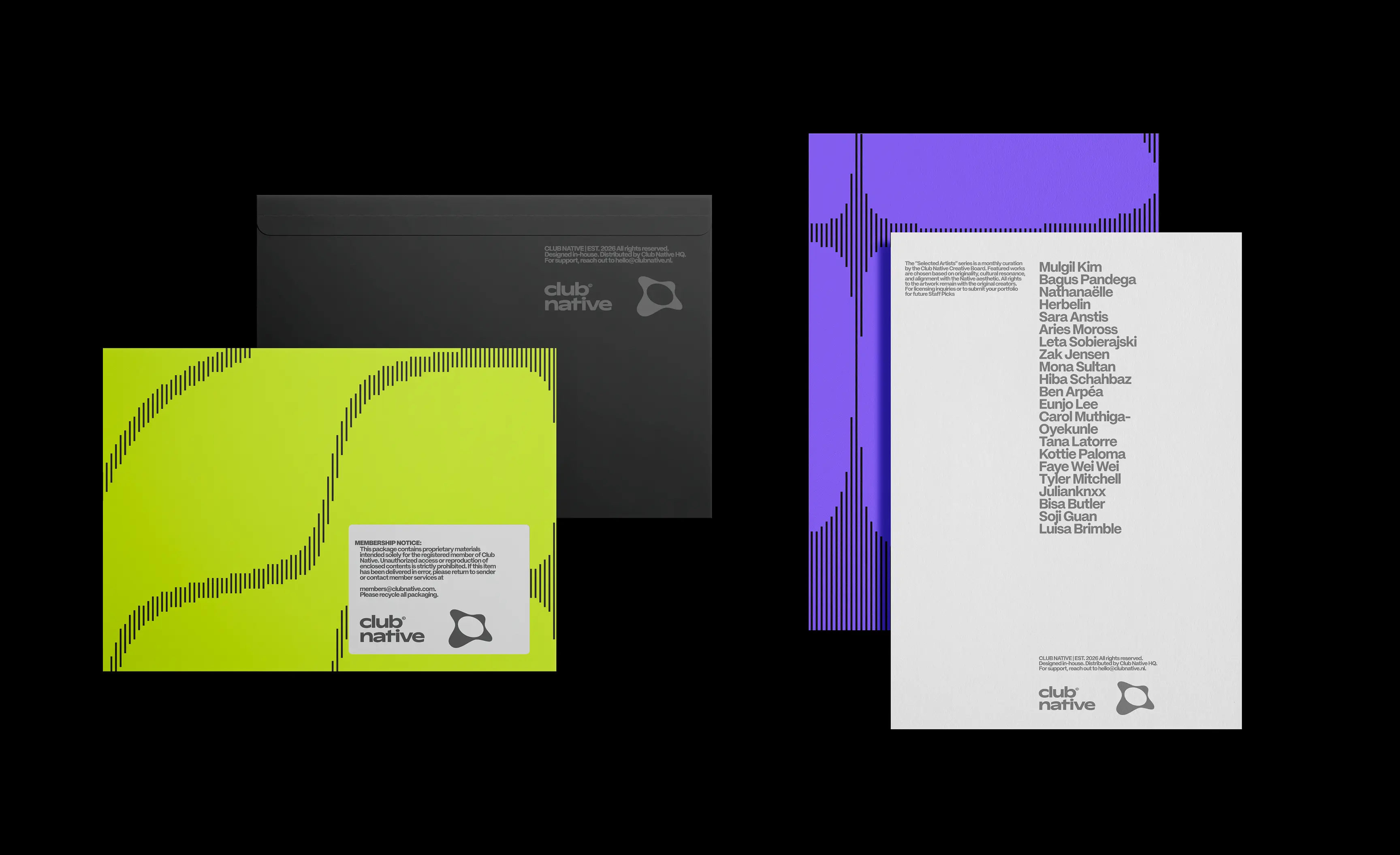
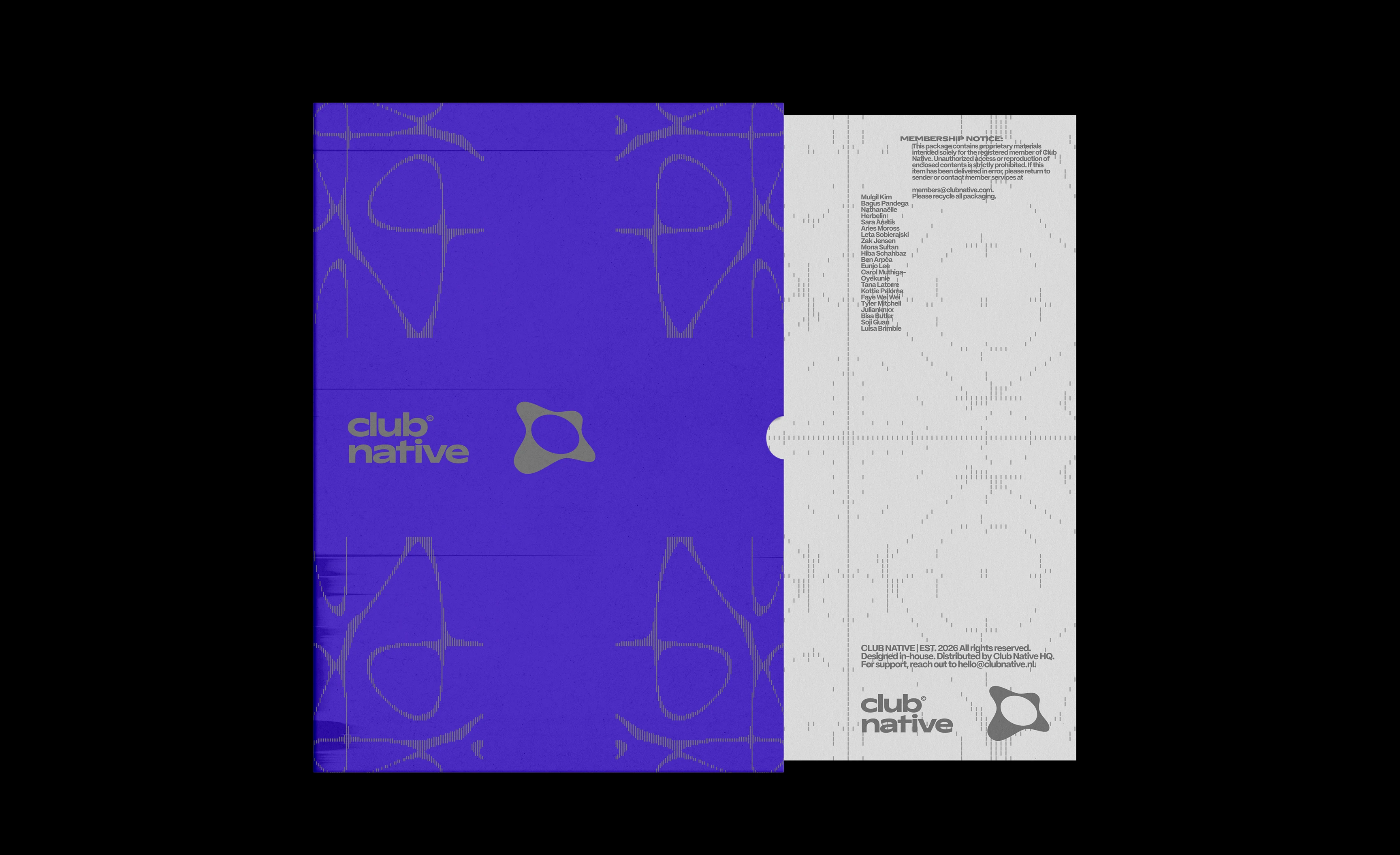
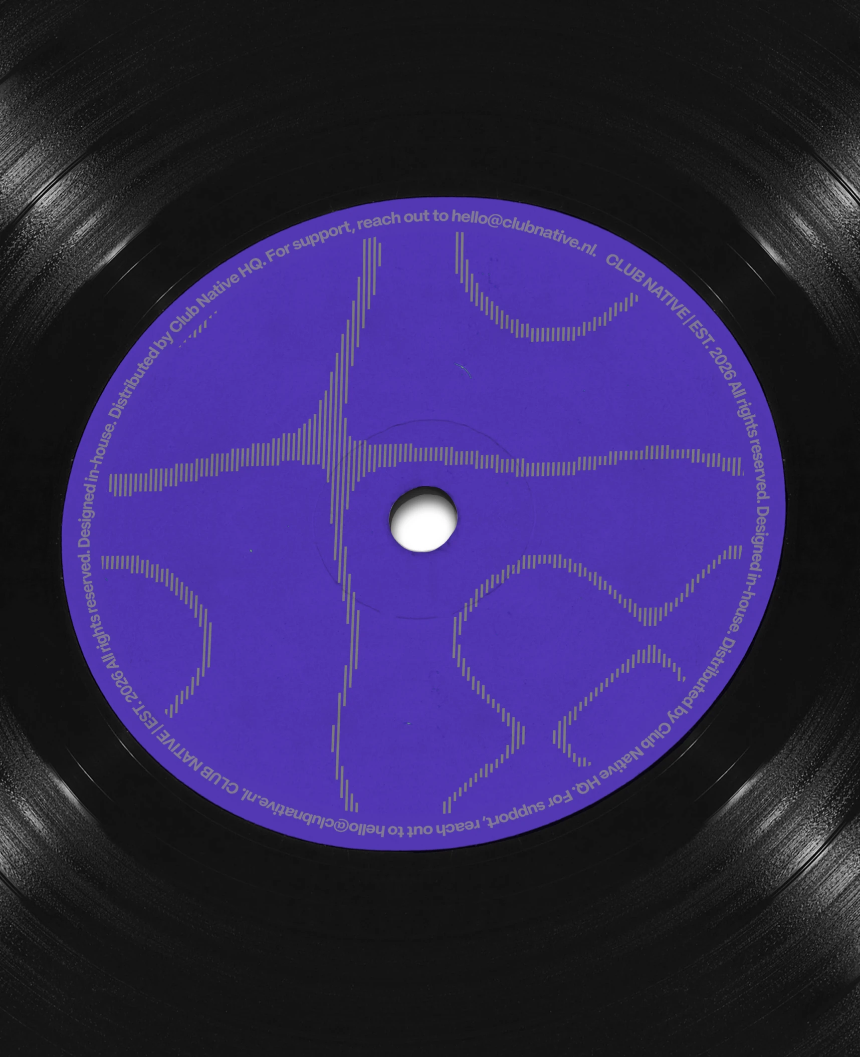
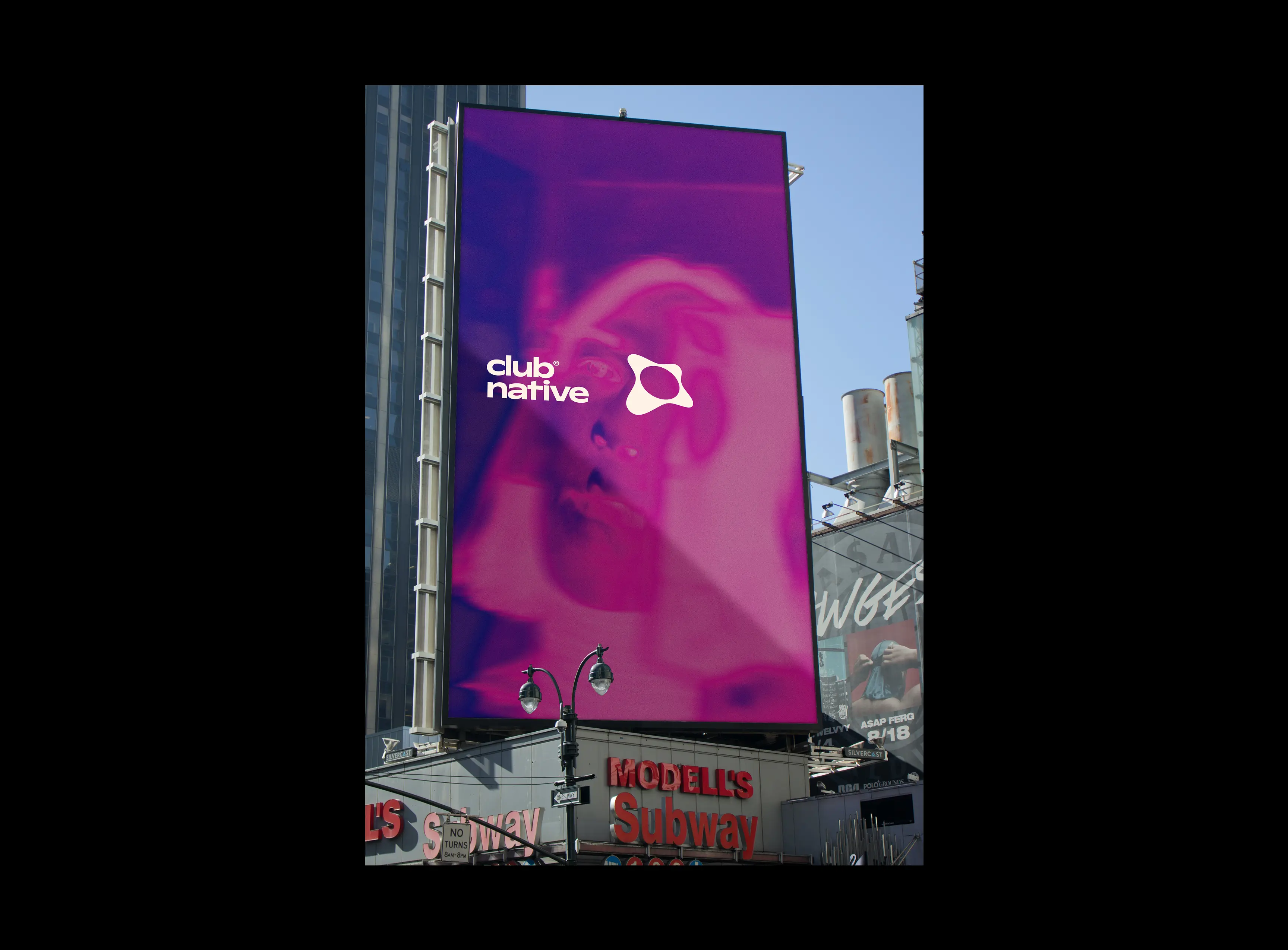
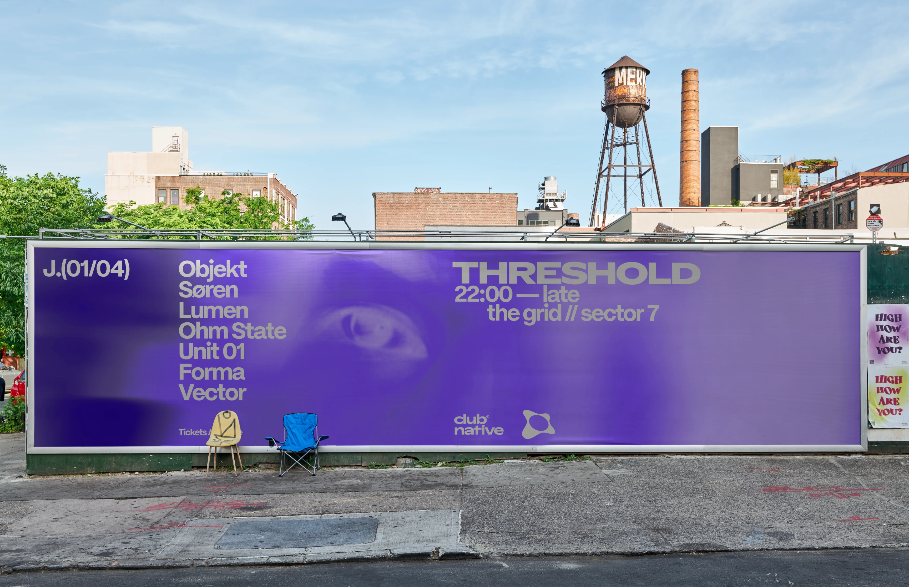
The visual identity is rooted in the physical reality of music: Cymatics. This concept is based on the principle that sound is the foundation and structure of the entire brand. These cymatic patterns are further utilised as framing elements and background textures to add depth across digital and physical applications. By using a systematic approach where sound waves create physical structure, the identity serves as a professional bridge between the artist and the audience.
Result
Through this strategic overhaul, ClubNative has successfully repositioned itself from a generic utility to an authoritative cultural destination built by the scene, for the scene. By adopting an identity that speaks the technical and visual language of electronic music, the brand now effectively competes with industry giants by offering what they cannot: authentic underground credibility.

00:00
/
00:00
00:00
/
00:00
Cymatic Studio
A custom web tool built to give the ClubNative team full creative control over one of the brand's most distinctive visual assets - its cymatic patterns. The patterns are generated in real time by adjusting parameters like harmonic mode, warp, density, and threshold. Designers can explore an infinite range of outputs, apply the brand colour palette, and export production-ready SVG files for use across digital and print touchpoints — without needing to open any design software. Built as a lightweight, hosted web app accessible to the whole team.
Try it out for yourself:
00:00
/
00:00
00:00
/
00:00
00:00
/
00:00


View More Work
.webp)

Passive Dynamics
Repositioning a specialist consultancy as an elite international authority.

Lab Stellar
A comprehensive brand identity, packaging, and web design project for Lab Stellar, a wellness brand fusing scientific precision with organic purity through a celestial-inspired visual system.
Beezy
A playful, vibrant brand identity with a friendly mascot and dynamic typography that makes shift scheduling feel approachable, engaging, and human.